FILE FRONT :
Tuesday, October 23, 2007
Week 12 Studio EXP3
Final Design Submission
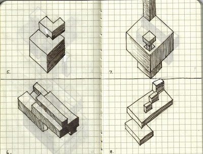
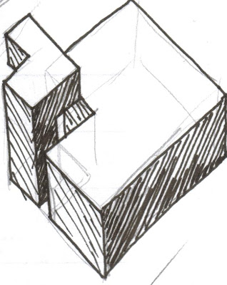
 Here shows an image of all three spaces. It shows of Zhang Yin's space as separated and elevated from everyone else as she only has one goal...
 To become the best in her industry, as she does nothing except look up, the skys the limit. Thus her space and elevator is designed to have a heavy base but open top thus emphasising her vision to become greater.
 Her elevator leads her back down to reality as panels allow her to subtley look down to those below her, until she reaches the meeting space with Ratan Tata. This space shows the different interpretation of power they both possess. Yin 's side is more enclosed, more private and elevated, while Tata's is vast, open and space dominating.
 Here shows an image of all three spaces. It shows of Zhang Yin's space as separated and elevated from everyone else as she only has one goal...
 To become the best in her industry, as she does nothing except look up, the skys the limit. Thus her space and elevator is designed to have a heavy base but open top thus emphasising her vision to become greater.
 Her elevator leads her back down to reality as panels allow her to subtley look down to those below her, until she reaches the meeting space with Ratan Tata. This space shows the different interpretation of power they both possess. Yin 's side is more enclosed, more private and elevated, while Tata's is vast, open and space dominating.
Week 11 Studio EXP3
Draft Submission
FILE FRONT Draft File:

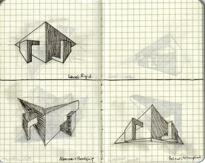
 Captures Zhang Yin's initial space, light construction, made up of multiple of components to show her build up of wealth, control and power.
 Captures both space in the frame, also shows the scope Yin has as a result of her elevated perspective.
 Shows Ratan Tata's space as monumental, but located close to the ground, close to the 'lower part of the pyramid'.
But his space is also very open providing great view for observation
as he plans for the future of those below him.
FILE FRONT Draft File:
 Captures Zhang Yin's initial space, light construction, made up of multiple of components to show her build up of wealth, control and power.
 Captures both space in the frame, also shows the scope Yin has as a result of her elevated perspective.
 Shows Ratan Tata's space as monumental, but located close to the ground, close to the 'lower part of the pyramid'.
But his space is also very open providing great view for observation
as he plans for the future of those below him.
Tuesday, October 2, 2007
Tuesday, September 18, 2007
Tuesday, September 11, 2007
Week 8 Studio EXP 3
3 Initial Articles
Ratan Tata:
http://www.tata.com/tata_sons/media/20060711.htm
Zhang Yin:
http://www.iht.com/articles/2007/01/15/business/trash.php
Carlos Slim:
http://www.catholic.org/international/international_story.php?id=24408
Ratan Tata:
http://www.tata.com/tata_sons/media/20060711.htm
Zhang Yin:
http://www.iht.com/articles/2007/01/15/business/trash.php
Carlos Slim:
http://www.catholic.org/international/international_story.php?id=24408
Sunday, September 9, 2007
Week 7 Studio Experiment 2
Final UT Design
 Outer design gives sense of variation, ease for adaptation, as the overall design is some-what symmetrical, as well as facilitating various modes movement, ramps, stairs etc.
 The designs suscetiblity to change is further complimented by the three different entry points to the inner space, as well as the different methods of reaching them, eg. ramps, jumping off ledges.
Tuesday, September 4, 2007
Week 6 Studio Experiment 2
Electroliquid Aggregation
'Intelligence is the ability to, speculate and observe, adapting to change if need be'
-Derek Wong
'Without speculation there is no good and original observation'
-Charles Darwin
'Intelligence is the ability to adapt to change'
-Stephen Hawking
'Intelligence is the ability to, speculate and observe, adapting to change if need be'
-Derek Wong
'Without speculation there is no good and original observation'
-Charles Darwin
'Intelligence is the ability to adapt to change'
-Stephen Hawking
Subscribe to:
Comments (Atom)


